

Compare top fundraising software
Compare Givebutter to online fundraising sites and donation platforms and see for yourself why Givebutter is the most-loved and highest-rated nonprofit software company across several categories.




Backed by the Givebutter Guarantee


for more features
3.95%
2.2% + $0.49


1%


GoFundMe’s main platform is free but GoFundMe Pro pricing isn’t publicly listed


Pricing depends on size of your organization
5.9% + $0.30

Givebutter’s editorial staff aims to bring you the most transparent and objective comparisons possible. We sourced these comparison metrics directly from fundraising websites and third-party review sites like G2, Capterra, Trustpilot, and more. Score data gathered February 2026.


See how Givebutter stacks up 🥞

The all-in-one platform your mission deserves
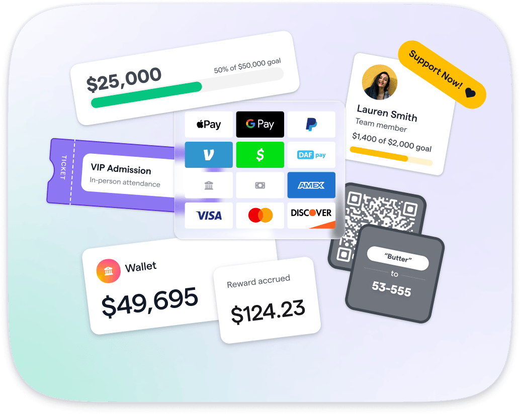

Raise more

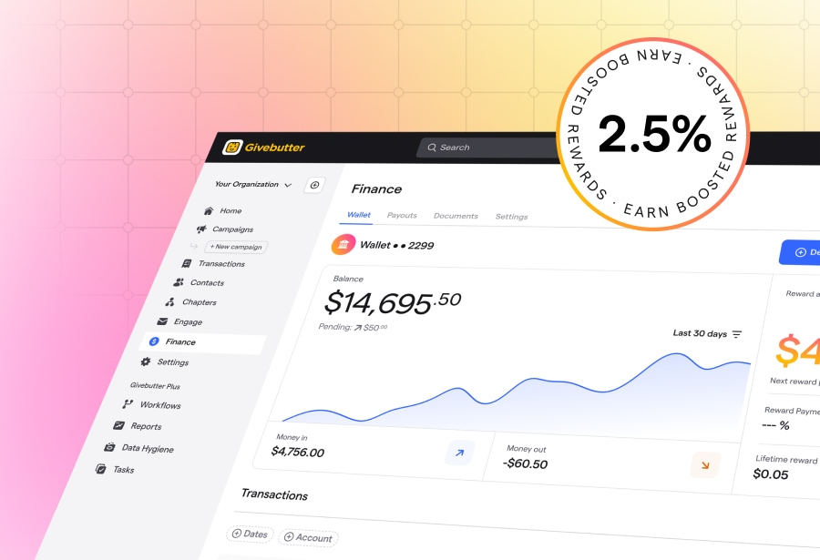
Givebutter brings together all of the modern fundraising and donor management tools nonprofits need under one roof, from donation forms and fundraising pages to events ticketing, auctions, CRM, email marketing, and more—plus 2.5% APY rewards on every dollar you raise.
.webp)

Pay less

Thanks to optional donor tips, Givebutter’s core fundraising features are free for all nonprofits. When tips are enabled, you pay $0—backed by the Givebutter Guarantee. Prefer to hide tips? Disable them and pay a flat 3% platform fee plus standard processing fees. For more advanced tools, Givebutter Plus starts at $29/month.
.webp)

Give better

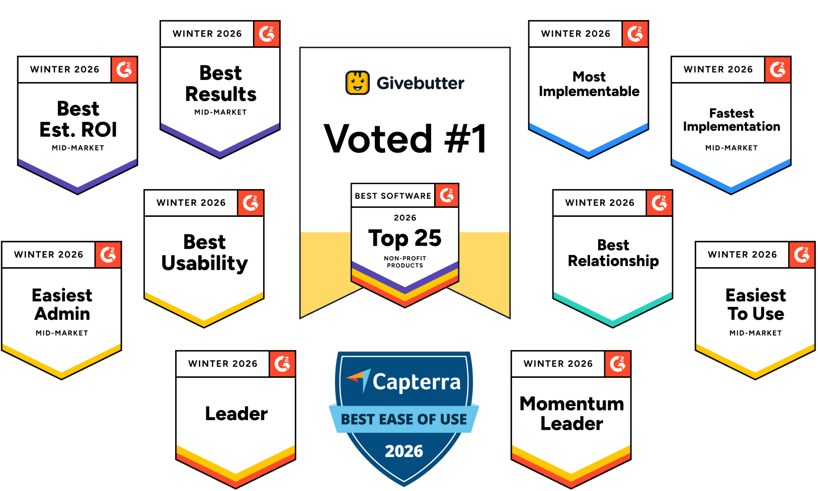
Givebutter is the most loved fundraising platform for nonprofits, and we’ve got the reviews to back it up. We have the most reviews and highest rankings on G2 across multiple categories, including fundraising, auctions, nonprofit CRM, and donor management. Plus, our support team is here for you 24/7, boasting industry-leading customer satisfaction ratings above 98%.


Integrate your favorite platforms
Check out what changemakers are saying
We’ve made switching as smooth as butter


Sign up for free
It takes just a few clicks to create your account and access Givebutter’s top-rated fundraising tools.
Make it your own
You don’t have to upload any data to get started, but we’ve made it easy for you to import all of your contacts, transactions, and recurring donations at no cost and without limits.
Reach new heights
You’re ready to go! Launch your first campaign, track progress toward your fundraising goals, and grow your donor relationships with ease.
Trusted by millions of changemakers at orgs like yours


Givebutter is the #1 Nonprofit Software of 2026
Named G2's Best Nonprofit Software of 2026, Givebutter is proud to be the most-reviewed and highest-rated nonprofit software company on G2—leading in fundraising, donor management, auctions, and more.
%201.jpg)


Winter 2026


.svg)
