Table of contents
Table of contents
Your nonprofit website design isn't just a digital brochure. It's where your impact comes to life, visitors become supporters, and giving turns into action. The best part? You don't need an agency, a big budget, or coding skills to build one that works.
With the right approach, any nonprofit can create a website that clearly communicates its mission, builds trust, and makes it easy for people to get involved. We'll walk you through the essential steps below, along with a simple (and free) alternative if you're not ready to build a whole site just yet.
Key takeaways
- Set your intention 🤔 Whether you’re looking to secure more donations, promote an event, or showcase your membership program, get clear on your website's core goals.
- Map out your site 🗺️ Outline the pages you’ll include, such as an about page, mission overview, resources, event registration, or other relevant sections.
- Choose a platform 🖥️ Use all-in-one website builders like Squarespace and Wix for simple, affordable site creation.
- Show proof of impact 💛 Highlight your mission and demonstrate impact with statistics, beneficiary stories, photos, and videos.
- Include clear CTAs 📣 Keep supporters moving with action-oriented CTAs like “Give today” or “Sign up to volunteer.”
- Use the right fundraising tools 🔧 Givebutter offers integrations with GoDaddy, Wix, Squarespace, and more, as well as free widgets to simplify web design and fundraising.
How to design a nonprofit website (DIY approach)
A great nonprofit website isn't about flashy design; it's about making it easy for supporters to understand your mission, see your impact, and take action. Follow these seven steps to build a site that does exactly that.
1. Decide what your website needs to do 🎯
Not every website is built with the same goal in mind. The best nonprofit website designs center around a clear purpose. The first step is to identify what you want your website to accomplish. For example, your website’s goal might be to:
- Explain your mission
- Collect volunteer sign-ups
- Accept donations
- Showcase impact
- Highlight your membership program
Setting clear goals makes it easier to measure success and stay focused as you add content, images, and CTAs.
2. Outline the main pages & sections 🗺️
Once you’ve defined your goals, it’s time to map out your website pages. Consider including the following sections:
- Mission overview 🧭 This is often the first thing visitors see. Include an abbreviated version of your mission, a few sentences about your work, and a strong visual.
- About page 📣 Share a brief explanation of what your organization does and how it started to help build credibility and trust.
- Next steps to get involved 🤝 Highlight upcoming events, volunteer opportunities, membership programs, recurring giving, or other ways supporters can deepen their engagement.
- Final CTA 👉 Inspire action with links to social media, giving pages, and email or newsletter sign-ups.
💡 Pro tip: Think of each page like a newspaper article. Lead with the most important information and big ideas, then go into the more nitty-gritty details.
3. Pick a website platform your team can manage 🧩
You don’t need technical know-how to build a nonprofit website. Platforms like WordPress, GoDaddy, Wix, Squarespace, and Weebly offer nonprofit website templates that make it easy to get started with a professional layout. And with Givebutter’s integrations, you can easily add a donate button directly to your site.
💡 Pro tip: All-in-one website builders can cost anywhere from $0–$150 per month, depending on features. Hiring a professional website designer costs significantly more, so choosing a user-friendly platform that your team can manage in-house can help keep expenses lower.
4. Design for mobile, accessibility, & clarity 📱
With 57% of nonprofit website traffic coming from mobile devices, each of your pages must be easy to view and navigate on smaller screens. You’ll also want to make sure your site is accessible to supporters of all abilities by incorporating:
- Image descriptions 🗨️ Add alt text to your images so screen readers can describe them to visitors with low vision.
- Accessible fonts and color palette 🎨 Choose simple fonts and a high-contrast color scheme to improve readability.
- Mobile optimization 📱Incorporate mobile-first design elements into your website like a simple layout, responsive design, and large buttons.
💡 Pro tip: All Givebutter features, campaigns, and forms are automatically optimized for mobile, helping ensure a smooth experience on any device.
5. Make it easy to donate & get involved 💛
Many visitors come to your website simply to learn more about your mission. Once they’re there, make it easy to take the next step, whether that’s registering for an event, signing up to volunteer, or making a donation.
💡 Pro tip: Modernize your website and guide supporters toward meaningful action with Givebutter’s easy-to-use donation widgets.
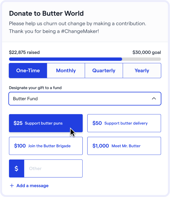
Turn visitors into donors with a free donation form
6. Build trust with proof of impact 👐
Your website should highlight how your nonprofit is making a difference. Regular updates build trust and donor confidence. To showcase your impact in a way that resonates, include:
- Program updates 🎤 Share photos and videos from recent programs to show what your organization has accomplished.
- Beneficiary highlights & testimonials 💫 With permission, spotlight individuals or communities you serve to demonstrate real-world impact.
- Statistics 📈 Use clear, eye-catching data points to illustrate why your work matters.
🎬 See it in action: A food bank updates its website to share that it served 500+ children this month, along with photos of volunteers distributing food and a short beneficiary story to highlight its impact.
7. Test, launch, & improve over time 🚀
Once you’re happy with how your website looks and functions, it’s time to publish. After launch, share your site on social media, in your newsletter, or through other channels where your supporters are active. Keep an eye on these key metrics so you can adapt and improve over time:
- Conversion rates 👀 Track how often visitors complete necessary actions, such as giving, signing up to volunteer, or registering for events.
- Usability 🖱️ Monitor page views and session duration to understand how easy your site is to navigate and how engaged visitors are.
- Most visited pages 💛 Look at where users spend the most time, then optimize your content to match their intent.
💡 Pro tip: Most website builders (Wix, Squarespace, GoDaddy, Weebly, WordPress) offer basic analytics, but connecting Google Analytics or upgrading your plan can offer deeper insights.
3 top nonprofit website design examples for inspiration
One of the most effective ways to get inspired and start planning your own website is to look at nonprofit website examples. We’ve included three of our favorite nonprofit web design examples, along with the features that stand out to their supporters and what they love most about their designs.
1. Black in Marine Science 🌊
Black in Marine Science’s (BIMS) homepage uses powerful visuals to represent its mission and draw visitors in. Key resources, including its membership directory, news, donation page, and educational content, are easily accessible directly from the homepage.
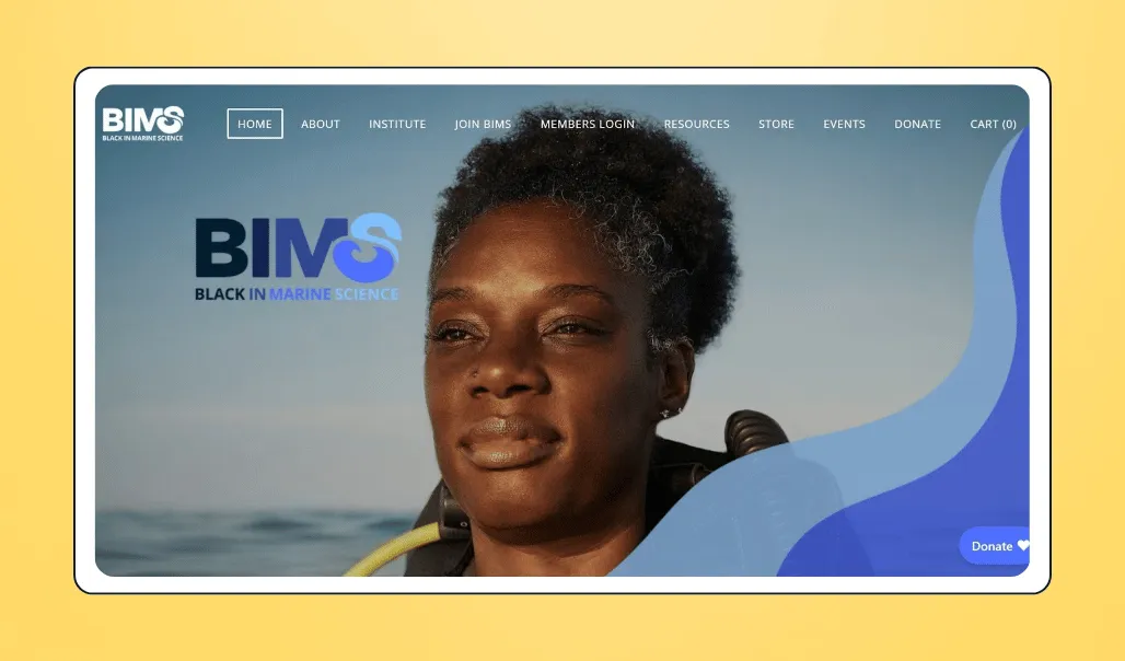
⭐ Standout feature: The BIMS donation page is highly accessible, with an easy-to-read format, contrasting colors, and a donate button embedded on their home page. Supporters can even credit their gift to a team member or give in honor of someone else.
💛 What donors love: The clean layout makes the site both easy to navigate and visually inspiring. It also has a dedicated page for the BIMS Institute, where supporters can learn more about the organization's research.
2. Historic Albany Foundation 🏰
The Historic Albany Foundation website makes it easy for supporters to explore the organization’s mission, join its membership program, donate, and connect through social media, all in one place.
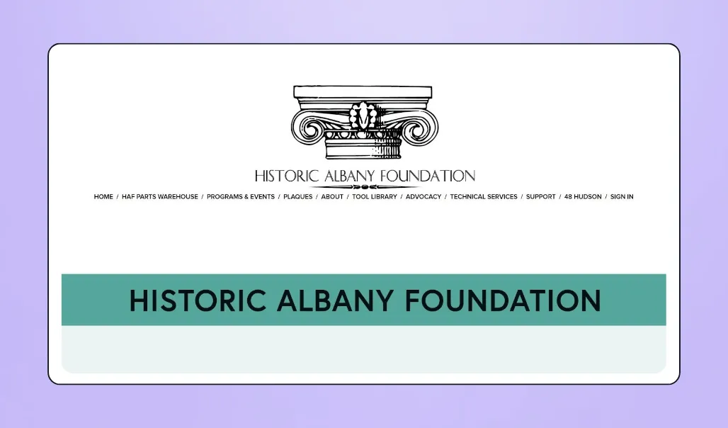
⭐ Standout feature: The simple logo, clear text, and brand-aligned visuals make navigating this website a smooth, intuitive experience, whether visitors are looking to donate or access educational resources.
💛 What donors love: The site offers a wide range of advocacy and technical resources, making it a hub for building community, and not just a fundraising site.
3. Vertile Foundation 🏫
If you want to raise money and spread the word on your mission without building a full website, take inspiration from the Vertile Foundation fundraising page. This customizable Givebutter donation page highlights the foundation’s mission front and center, with clear options for one-time, monthly, or quarterly giving.
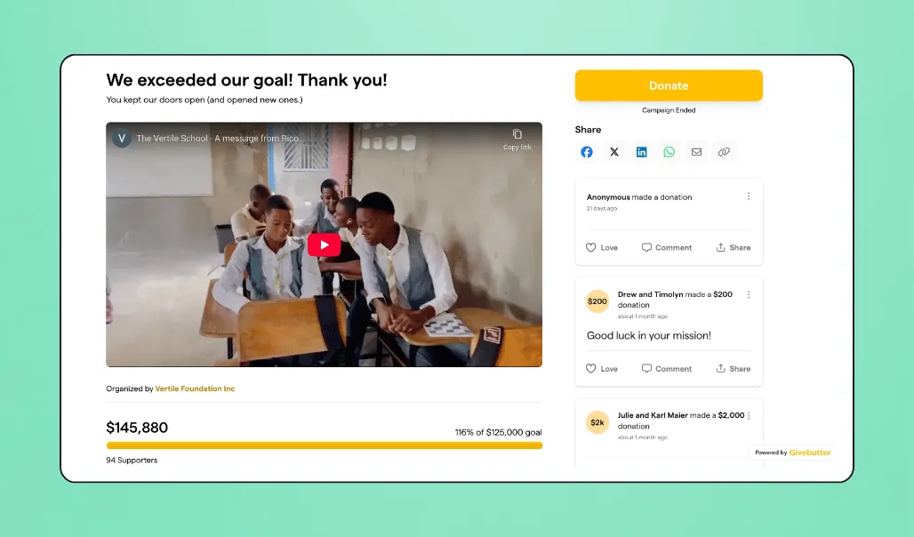
⭐ Standout feature: The page features an impactful beneficiary story, including video and photography, to encourage giving.
💛 What donors love: Supporters can find everything they need in one place, from how their gift makes an impact to key campaign dates and details about an upcoming fundraising auction.
Nonprofit website design best practices
Even a basic website can help build brand credibility and encourage more giving. If you’re ready to take your site to the next level and keep supporters engaged, follow these nonprofit website best practices:
- Make it scannable 👀 Break up text into short paragraphs, bulleted lists, and clear headings. This helps convey your message and encourages visitors to keep scrolling.
- Keep pages fresh 🍞 Assign someone to update your site regularly so content stays current and highlights your nonprofit’s latest achievements and opportunities for engagement.
- Optimize for donation flow 🌊 Beyond adding a donation button, make giving easy with embedded donation forms, suggested amounts, and options for recurring giving.
- Keep it action-oriented 🎬 Prioritize clear calls to action and buttons over elaborate visuals. Whether visitors want to donate, learn more, or volunteer, the next step should always be obvious.
- Build your larger strategy 🖥️ Your website is just one piece of your broader marketing strategy. Pair it with a strong social media presence, a powerful fundraising platform, and ongoing search engine optimization (SEO).
Transform your nonprofit web design with Givebutter
A great nonprofit website design isn't built overnight, but with clear goals, the right platform, and a focus on accessibility and donation flow, you can create a site that inspires action. Keep your content fresh, make giving frictionless, and remember that your website is the foundation of your digital presence.
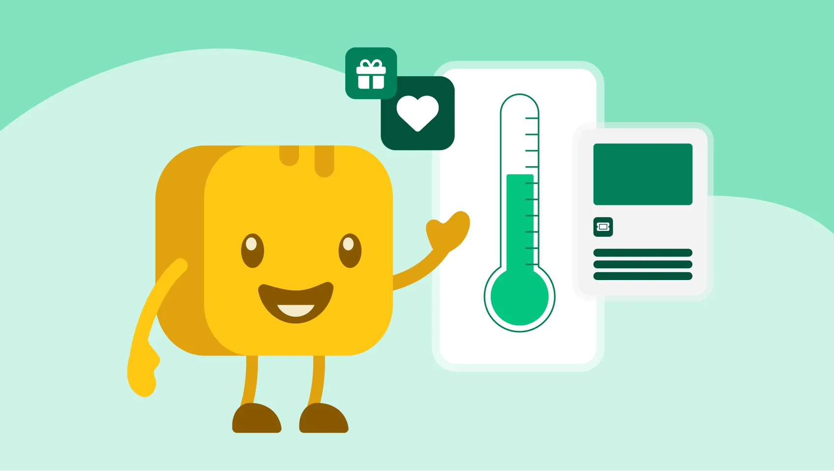
When you’re ready to put your plan into action, Givebutter makes it easy. You can add a free donation form or widget to your website in minutes, integrate seamlessly with platforms like Wix, Squarespace, and WordPress, or skip a full site build and launch a customizable Givebutter fundraising page instead. Add videos, beneficiary stories, team leaderboards, fundraising thermometers, and everything supporters need to give and get involved.
⭐️ Sign up for free today and start building a nonprofit website that works as hard as you do.
FAQs about web design for nonprofit organizations
Do nonprofit websites need paid hosting?
You don’t need paid hosting to launch a nonprofit website. Some platforms, like Weebly and WordPress, offer free basic options. Website builders like Squarespace and Wix typically start at around $15 a month, and include more robust, easy-to-use features.
If you’re not ready to build a website, Givebutter has all the tools you need to launch your fundraiser for free.
What’s the easiest platform for nonprofit web design?
Wix and Squarespace are among the easiest platforms for nonprofit web design because they require no coding and offer intuitive drag-and-drop builders. Both integrate seamlessly with Givebutter, allowing you to add donation forms and fundraising widgets to your site in minutes.
How much does a nonprofit website cost each year?
A nonprofit website can cost anywhere from $0 (for basic features) to $150+ per month. Hiring an agency can cost several thousand dollars or more, which is why many nonprofits opt for DIY website builders.
Do nonprofits need to hire a web design agency or firm?
Not necessarily. Some nonprofits work with an agency for advanced design or for broader digital strategy, such as SEO or analytics. Many others build and manage their website themselves using affordable, all-in-one platforms like GoDaddy, Squarespace, and Wix.
Who owns & maintains a nonprofit website after it launches?
In most cases, you’ll need to designate someone in your nonprofit as your website owner after launch, even if you worked with an agency. This person is responsible for regularly checking the site, updating content, and ensuring CTAs reflect your nonprofit’s current goals.
.svg)


.webp)
%20(1).png)


.svg)


