Table of contents
Table of contents
Picture this: a potential donor lands on your page, with a credit card in hand, ready to make a difference. But your page is confusing, bland, or about as inspiring as a tax form. For many supporters, that's enough to click away.
Now imagine instead that your donation page is a magnet for generosity.
We’ll explore the best strategies to optimize your donation or fundraising pages so they tell your story, connect with donors on a deeper level, and inspire more giving.
Key takeaways
- The right platform matters: A strong donation page starts with tools that are customizable, mobile-friendly, and built for nonprofits.
- Design and storytelling drive action: Use photos, video, and impact-driven copy to connect with donors and show them exactly where their gifts go.
- Small details can have a big impact: Preset gift amounts, recurring giving defaults, and bold call-to-action buttons can significantly boost conversions.
- Offer multiple ways to give: Credit cards, PayPal, Venmo, Apple Pay, Google Pay, Cash App, and ACH all make giving easier.
- Donor follow-up is just as important as the page: Automate thank-yous, receipts, and updates to keep supporters engaged long after their first gift.
- Givebutter does it all: Build a free, custom donation page that integrates with your CRM, reporting, and donor engagement tools—all in one place.
Take the quiz: Where is your donation page in need of improvement?
Your donation page may look polished, but is it optimized to convert visitors into donors? Even small tweaks—like preset giving amounts or a mobile—friendly design—can dramatically boost giving.
This quick quiz will pinpoint where your donation page is strong and where it may be falling short. Use your results as a roadmap, then keep reading for proven strategies and real nonprofit examples to put your insights into action.
How to set up a donation page that converts in 6 simple steps
Whether you’re setting up a donation landing page as part of your event planning checklist or you’re looking to gather general donations, these six steps will help you launch quickly and effectively.
Watch the video below to learn how to make a donation page that drives results, and keep reading for even more top tips!
1. Choose the right fundraising platform 💪
Selecting the right fundraising platform is like laying the foundation for a house—everything else you build depends on this decision. And while there are plenty of options available, not all platforms are created equal.
When comparing options, ask yourself:
- Does it allow full-page customization?
- Are there built-in social sharing features?
- Can you track donations in real time?
- What kind of customer support is available?
- Are there any setup or monthly fees?
Want a platform that checks all these boxes? Givebutter lets you create custom fundraising pages—with multiple payment options, gift types, donation widgets, and more—for free on any site (including website hosts like Squarespace, GoDaddy, Weebly, and Wix).
%201.png)
Embed a free donation form on your site
2. Customize your design & tell your story 🎨
The look of your donation page can have a major impact on how donors engage with it. But the good news is that you don’t need a degree in graphic design to make it impactful. Simple tweaks can make your page stand out and inspire more donations.
Here’s how to visually showcase your cause:
- Add photos, graphics, illustrations, and video content
- Share real impact stories and quotes
- Customize donation tiers with meaningful details (e.g., $50 provides 10 school lunches)
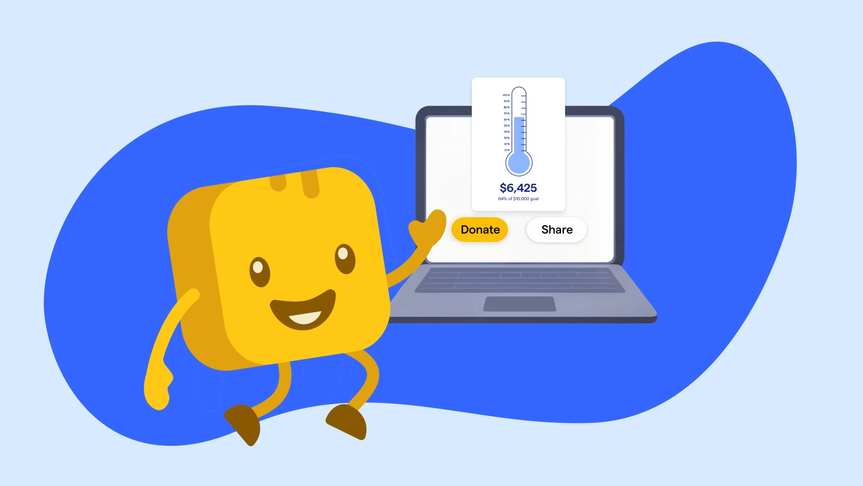
- Display real-time progress toward your goal with a fundraising thermometer
💡Pro tip: Givebutter makes it easy to show donors the impact their support makes with a Canva integration, customizable donation tiers, image and video features, and more.
3. Use preset amounts & encourage recurring giving 💸
Did you know that recurring donors give an average of $288 per year compared to a one-time gift of $155? Yet only 14% encourage donors to opt in to recurring giving. By adding a recurring donation option to your online donation page—and promoting it within the donation form—you can easily turn one-time donors into long-term supporters.
With Givebutter, you can seamlessly offer monthly, quarterly, or yearly recurring donation options. You can even set recurring gifts as the default donation choice or enable automated upsell messages that invite one-time donors to switch to monthly giving.
It’s also helpful to include preset gift amounts so donors don’t have to spend time deciding how much to give. For example, a nonprofit might list giving levels like:
- $25: Provides school supplies for one student
- $100: Funds two weeks of after-school tutoring
- $500: Covers a full semester of educational support
- $1K: Provides a scholarship for one student
And don’t forget to make your donate button clear and easy to spot—it’s the first step supporters look for when deciding to give.
4. Offer multiple payment methods 💳
It’s true that 63% of donors prefer to give via credit or debit card. But that doesn’t mean nonprofits should only provide one payment method.
Offering flexible, secure payment options makes giving more accessible, simpler, and easier—keeping supporters on the page and in the donation process rather than clicking away.
In addition to debit and credit cards, be sure to include popular payment methods like:
- PayPal and Venmo
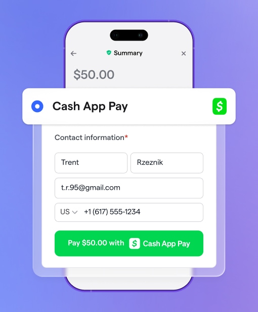
- Cash App
- Apple Pay and Google Pay
- Donor-advised funds (DAF donations)
- ACH donations
- Tap to Pay
- Offline donations (e.g., checks and cash)
5. Test and preview your page 🕵️
Before launching your fundraising campaign, be sure to test your page to ensure it’s free of any technical issues so your process is seamless for donors. This might include:
- Verifying donation button functionality
- Checking mobile and desktop responsiveness
- Testing all external links
- Confirming payment processing works smoothly
- Reviewing the page on multiple browsers
- Assessing load speed
6. Thank & engage donors instantly 💛
Thoughtful, transparent follow-up turns one-time donors into lifelong supporters who feel genuinely connected to your mission and excited about the change they're helping to create.
To simplify donor stewardship, be sure to:
- Set up a supporter feed to engage with donors in real time
- Use workflow automations so you never miss a chance to connect with donors
- Enable automatic donation receipts for instant gratitude
10 best donation page examples from real nonprofits
If you're still not sure what a stellar donation page should look like, don’t worry—we've got you covered. Here are 10 of the best donation page examples to help you get inspired as you create your own.
1. Black in Marine Science 🐬
For Black in Marine Science, every gift fuels ocean innovation and uplifts the next generation of marine scientists. With a clear fundraising goal and multiple giving pathways, donors can see exactly how their contributions advance education, research, and equity in marine science.
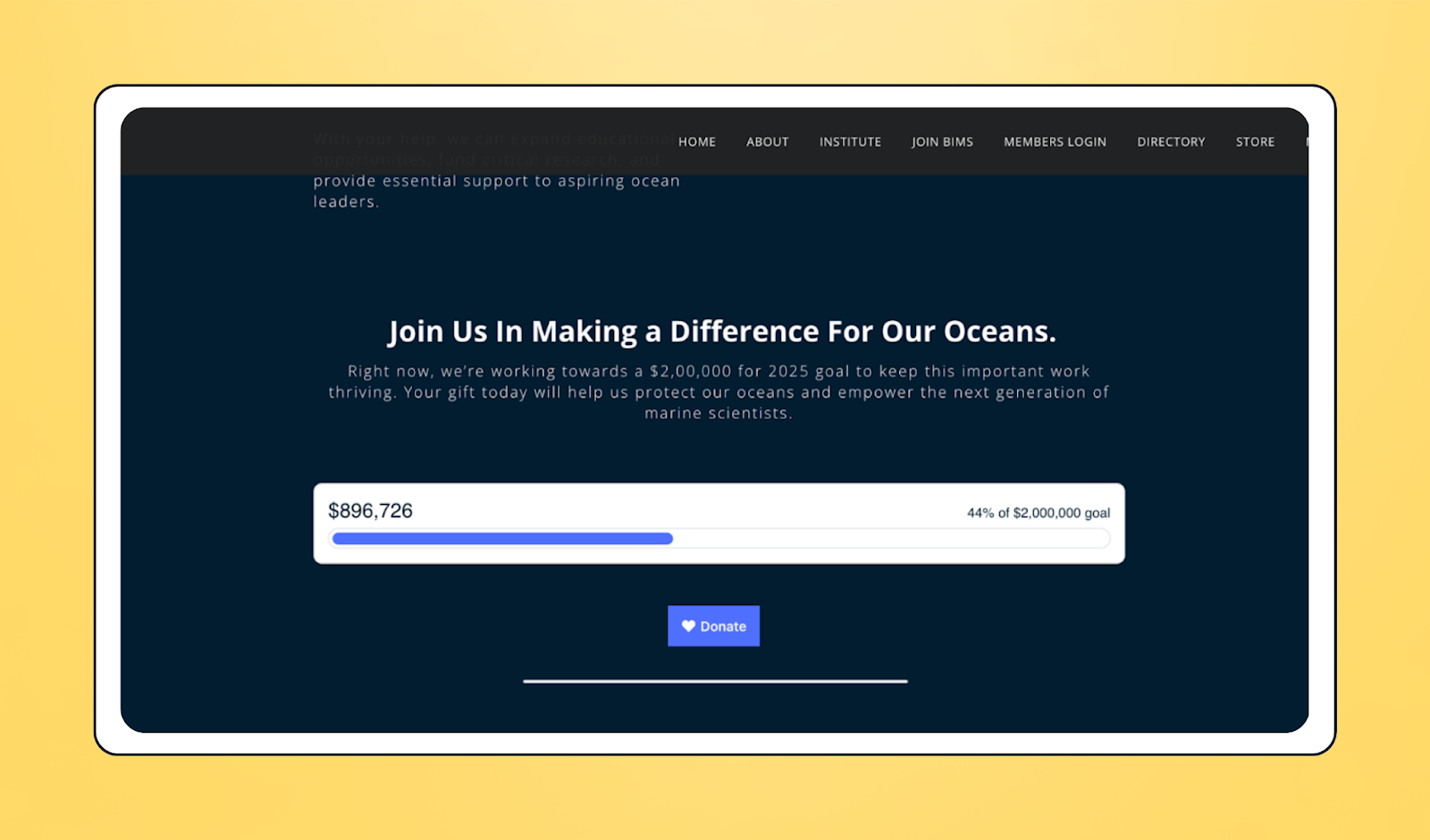
⚡ Standout feature: Fundraising thermometer
🏆 Why it works: By combining a bold $2M campaign goal with accessible entry points (monthly giving, BIMS Champions, and major gifts), BIMS makes every donor feel part of something bigger. Real-time progress tracking builds urgency, while impact highlights (like funding SCUBA certifications and conferences) show the tangible outcomes of donor support.
2. Wings of Rescue 🐶
When pets are at risk in overcrowded shelters and disaster areas, Wings of Rescue steps in and flies them to safe havens. The strong branding and visuals on their donation page capture this urgency.

⚡ Standout feature: Real image of impact
🏆 Why it works: The prominent photo on their donation page immediately shows supporters what’s at stake—and why their contributions matter.
3. Jericho Project 🏠
Focused on alleviating homelessness, Jericho Project’s donation page is simple, clean, and designed for maximum ease of use.
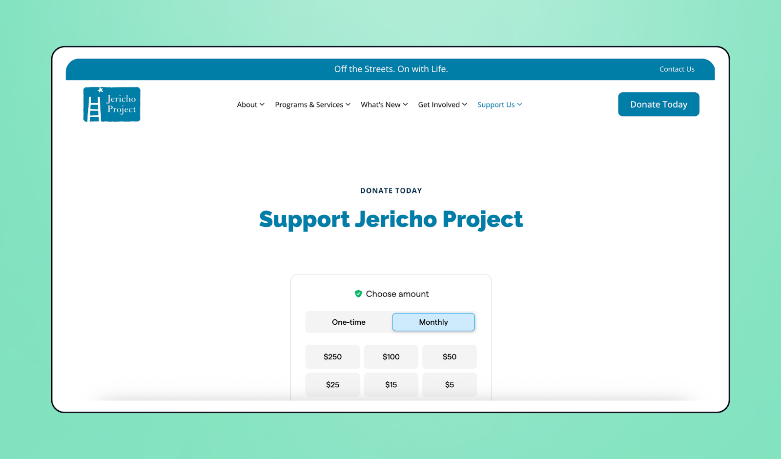
⚡ Standout feature: Recurring and one-time donation options
🏆 Why it works: Flexible giving options encourage a wider band of support. This page gives donors complete control over the amount and frequency of their gift while sustaining impact.
4. Latino Leadership Institute 🌎
The Latino Leadership Institute frames giving as an investment in Latino potential—fueling careers, businesses, and networks that uplift entire communities. Their donation page effectively communicates a message that is bold, urgent, and centered on collective action.

⚡ Standout feature: Bright eye-catching colors that align with the brand
🏆 Why it works: Instead of focusing solely on programs, LLI positions donations as a way to power systemic change and long-term growth. This rallying language empowers donors to feel like active partners in shaping a more equitable future.
5. Mission Bit 👾
Beyond a standard donation form, Mission Bit’s website also features a dedicated page just for its recurring donation program. The page combines statistics, photos, and testimonials into a compelling case for monthly support.
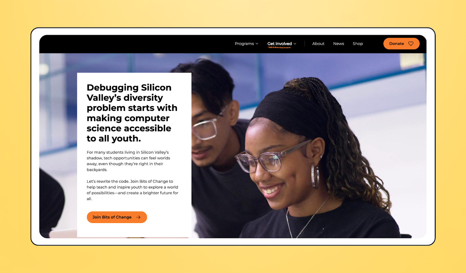
⚡ Standout feature: Recurring donations
🏆 Why it works: The embedded donation form widget includes descriptions for each giving level that help donors feel like they’re part of the ongoing solution, whether they give $10, $25, or $100 each month.
6. NR2F1 Foundation 🧪
Building trust is at the core of NR2F1 Foundation’s donation page, which clearly shows how contributions are used—proudly noting that 80% of funds in 2024 went directly to research initiatives. Donors also get flexible ways to give, from online donations to checks and donor-advised funds.
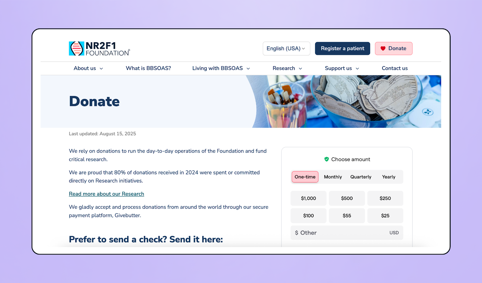
⚡ Standout feature: Transparency about donation use
🏆 Why it works: By highlighting how gifts power critical research, NR2F1 reassures supporters that their contributions have a measurable impact. Multiple giving options make the process accessible for donors worldwide while reinforcing both credibility and trust.
7. LOGAN Hope 🏫
The LOGAN Hope giving page demonstrates the many ways supporters can contribute—from one-time or monthly gifts to stock transfers, legacy giving, and even Pennsylvania’s tax credit programs. It frames donations as an investment in accessible, Christ-centered education for students in North Philadelphia.
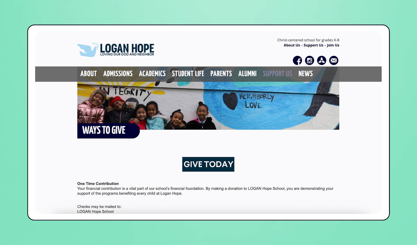
⚡ Standout feature: Wide variety of giving options
🏆 Why it works: By offering ACH and PayPal alongside appreciated assets, bequests, and matching gifts, LOGAN Hope maximizes giving potential while meeting donors where they are, so anyone can find a way to get involved.
8. Hearts of Joy International 💛
Few donation pages make an impact as tangible as Hearts of Joy International’s. With giving levels tied directly to life-saving surgeries, airfare, food, and supplies, donors immediately see how their support transforms a child’s future.
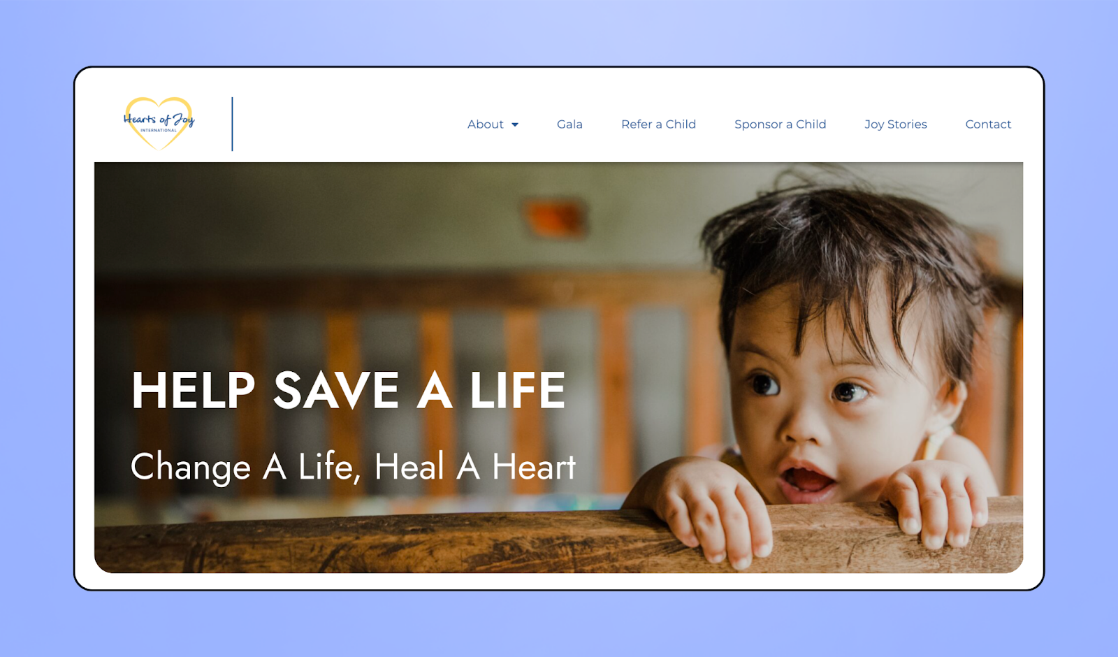
⚡ Standout feature: Impact-driven donation tiers
🏆 Why it works: Each dollar amount connects to a real-world outcome—like funding a full heart surgery or providing formula during a hospital stay. This page removes guesswork, inspires generosity, and shows donors exactly how their contributions change (and even save) lives.
9. Trinity Church ⛪
Simple design is the superpower of Trinity Church's donation form. Clear explanations about the impact of donations and the ability to designate how funds are used builds trust and connection with donors.
Plus, a frictionless giving experience—including the option to make a one-time or recurring gift—means donors can contribute with just a few clicks.
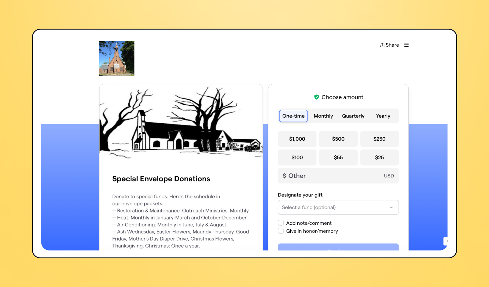
⚡ Standout feature: Fund designation
🏆 Why it works: Allowing supporters to donate in someone’s honor and choose how their gift is used creates a personal connection. The added flexibility gives donors a greater sense of ownership and pride in their contribution.
10. Stone Soup Cafe 🍲
Stone Soup Café’s Kitchen Collective transforms monthly giving into a movement. Their donation page highlights community, belonging, and the simple power of showing up with “whatever ingredients you have to give.”
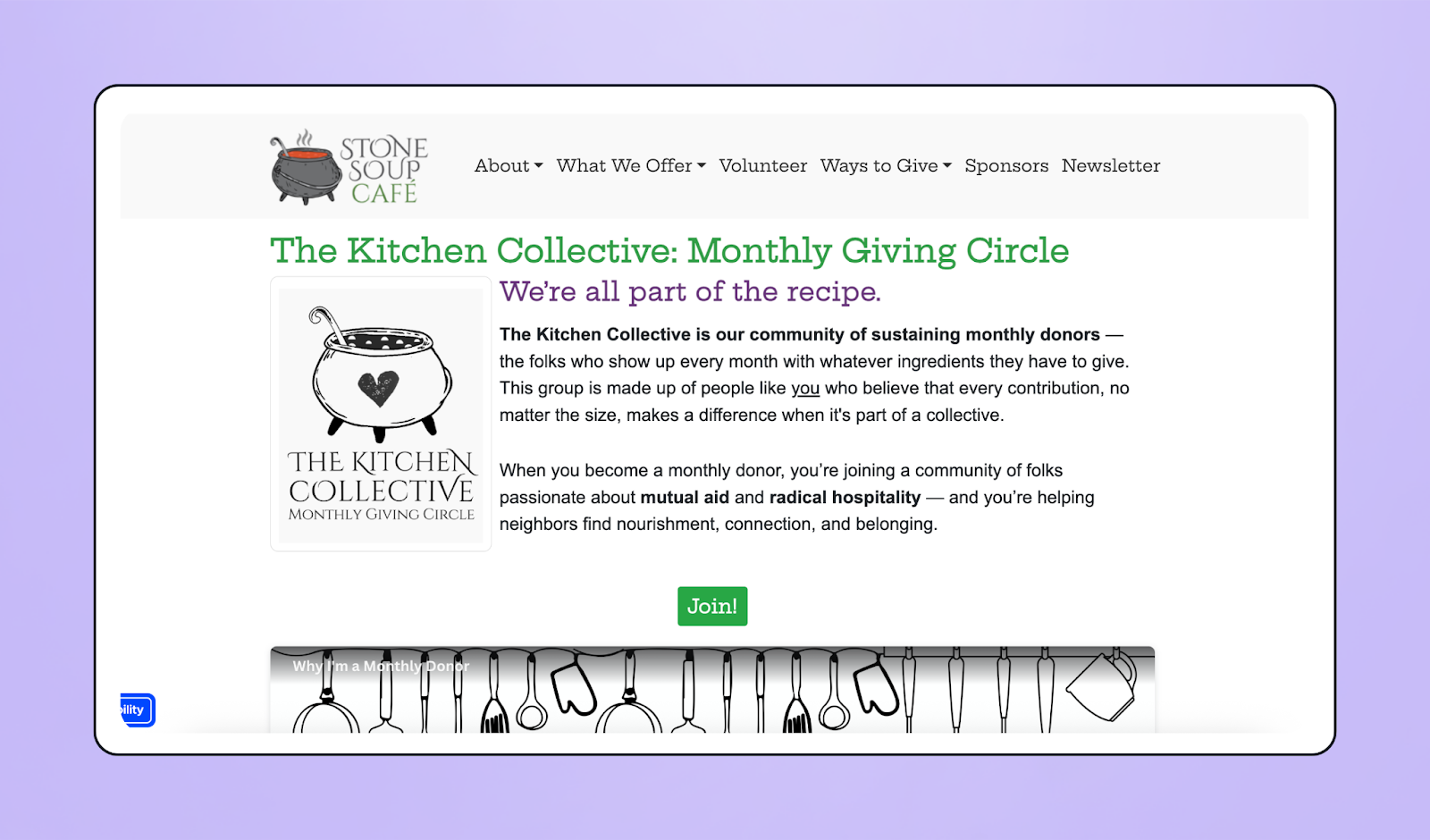
⚡ Standout feature: Community-focused language and donor incentives
🏆 Why it works: By framing recurring giving as being part of “a recipe for change,” the Kitchen Collective makes monthly giving feel joyful and accessible. Paired with fun donor incentives like raffle prizes, the page turns giving into a movement that supporters want to join.
Craft a donation page that raises more with Givebutter
With the right best practices—like storytelling, user-friendly design, and compelling imagery—you can create a donation page that supporters can’t help but engage with.
The best part? You can build it all for free with Givebutter.
Givebutter is the all-in-one fundraising solution that makes it easy to create beautiful donation pages, communicate with donors in multiple ways, and embed donation widgets directly on your website.
Create your free account and discover how you can level up your donation page today.
FAQs about nonprofit donation pages
Have a question about donation pages? Here are some of the top questions nonprofits ask, along with our best advice.
Can I set up a donation page for free?
Yes! Givebutter lets you create and customize your donation page, then embed it into the website host you use—like Squarespace, Wix, or Weebly.
But while other platforms charge monthly fees, you can get started for free with Givebutter.
What’s the best platform to create a donation page?
It depends on your needs, but ideally, the platform should let you manage fundraising, donor data, and outreach all in one place. It should also integrate with your host site (GoDaddy, WordPress, and more).
Givebutter offers donation pages, embeddable forms, website widgets, and more, making it a strong choice for small and growing nonprofits.
How can I improve conversion rates?
To improve conversion rates, highlight monthly giving options, test different preset donation amounts, and ensure your donation button (or call to action) is large and bold so donors know exactly where to click.
What minor tweaks actually boost donations?
Adding a clear “Ways to Give” dropdown menu, preset donation amounts, or a dedicated giving methods section (credit/debit, ACH, donor-advised funds, stock contributions, matching gifts, etc.) can make a big difference. Organizing giving options makes the process simpler for donors, which can lead to an increase in contributions.
What do I write on a donation page?
Your donation page should inspire people to give to your cause or campaign. Use storytelling, quotes from your team or beneficiaries, and impact statements that show the value of donating. Complement text with photos and videos to further illustrate your story.
.svg)


%20(1).png)


.svg)


